How we connect to the Internet has changed drastically in today’s digital age. Due to the proliferation of mobile devices, an enormous shift has occurred in web design; enter the Responsive Design Revolution. This Revolution isn’t just about making pretty pages; it’s an all-encompassing method for making responsive web applications look great on any device.
The Evolution of Web Usage Across Devices
The trajectory of web usage has evolved dramatically over the past decade. Internet access is no longer limited to fixed locations; portable gadgets have made this possible. Users increasingly anticipate a consistent experience regardless of location or device. As a result of these changes, conventional wisdom about how to build websites has had to be overhauled.The Need for User-Centric Design
Users’ expectations have skyrocketed in the era of multiple device use. They expect nothing less than perfection from every service they use. That calls for moving away from concentrating on the gadget itself and toward one more centred on the end user. The core principle of the Responsive Design Revolution is to tailor interfaces to users’ interactions with information by considering their requirements and preferences.Understanding Responsive Design
The foundation of the Revolution rests on the concepts of responsive design. The concept of fluidity is fundamental, and it refers to the responsiveness of websites to changes in screen size and orientation.Definition and Principles of Responsive Design
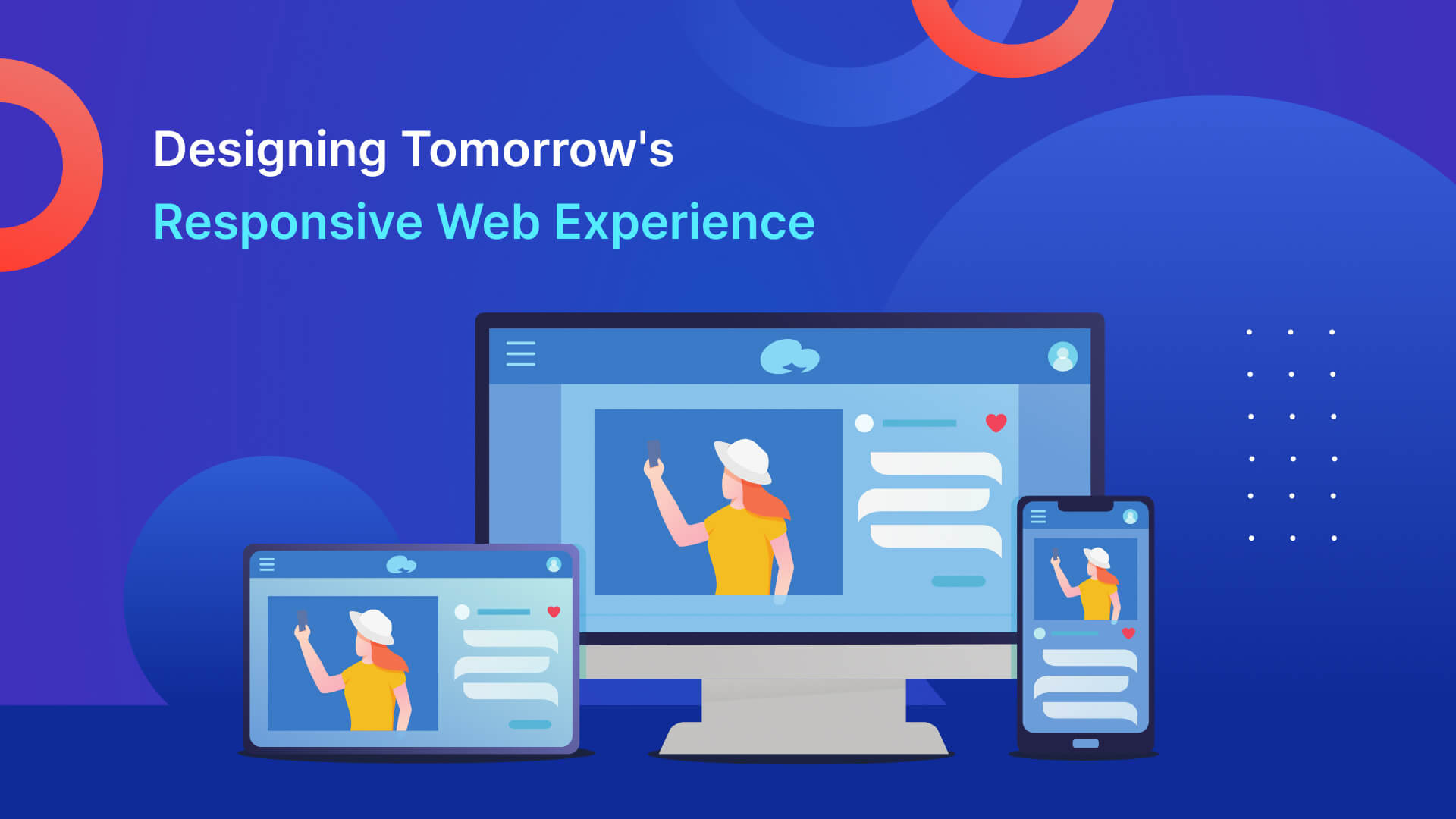
The term “responsive design” describes creating websites and online apps that may “respond” to the screen size used to see them. Using fluid pictures, media queries, and adaptable grids allows for this flexibility.Fluid Grids and Flexible Layouts
Responsive layouts rely heavily on fluid grids. Fluid grids enable items to expand and contract proportionately, unlike fixed-width layouts. That guarantees the consistency of information presentation across devices inside web applications.Media Queries for Adaptive Styling
In web application responsive design, media queries play a crucial role by allowing different styles depending on the user’s device. These queries determine where to adjust the design to provide a smooth experience across various device widths.The Impact of Mobile Devices
The Rise of Mobile Traffic
Many people’s first point of contact with the Internet is now their mobile phone. The growing popularity of mobile devices has highlighted the need to develop mobile-friendly web applications.Challenges of Non-Responsive Websites
There are many obstacles that web apps that need responsive design must overcome. Sites that need to be optimized for mobile devices often frustrate visitors, which increases bounce rates and causes businesses to lose out on potential sales.Benefits of Responsive Design for Mobile Users
Responsive design aims to overcome these problems by making websites work properly across a wide range of devices without sacrificing readability, usability, or aesthetics. Responsive design optimises mobile experiences for various screen sizes, leading to greater user engagement and pleasure.Key Components of Responsive Design
Mobile-First vs. Desktop-First Approach
The choice between a mobile-first and a desktop-first strategy lies at the heart of responsive web app design. A mobile-first strategy prioritises efficiency and allows for a smooth transition to larger displays. Designing for smaller displays after the fact is what’s known as a “desktop-first” strategy.Scalable Images and Media
Images are a powerful form of communication, but they must be managed securely across platforms to maintain effectiveness. Thanks to methods such as CSS’s max-width property, images that scale well preserve their quality and relevancy over a wide range of screen sizes without compromising on their original dimensions.Typography and Readability Across Devices
User experience is greatly affected by typography. The function of typography in responsive web app design goes beyond aesthetics and into the realm of readability. Legibility is ensured by relative font units and suitable line heights, keeping textual material interesting and easily accessible across devices.Creating Seamless User Experiences
Consistency Across Devices
The best user experiences go beyond individual gadgets. Maintaining the same aesthetic, identity, and set of interactions across devices helps consumers transition easily.Intuitive Navigation for Touchscreens
Touchscreen navigation is quite different from mouse navigation. A responsive app design makes menus and buttons large enough to easily tap on a mobile device’s screen to allow touch interactions.Designing for Various Screen Orientations
The responsive layout considers that people use their devices in various ways. The web app should smoothly transform between portrait and landscape orientations, keeping all information accessible and looking good.Responsive Design Techniques
Breakpoint Strategy for Different Devices
For responsive web application design to work, breakpoints must be used to determine when to adjust the layout. With careful consideration of breakpoints, content layout and design may be optimized for various device sizes.Flexbox and CSS Grid for Layouts
The advent of modern CSS layout tools like Flexbox and CSS Grid has revolutionized the web app development process for responsive layouts. Flexbox is great for creating layouts that can change on the fly, while CSS Grid gives you fine-grained control over how your rows and columns are laid out.Icon Fonts and Vector Graphics
Scalable options for integrating icons into web applications may be found in icon fonts and vector graphics. Uniform icon presentation across platforms is made possible by icon fonts representing certain characters. When scaled up or down, the quality of vector visuals like SVG remains unaffected.Testing and Debugging
Cross-Browser and Cross-Device Testing
The success of a responsive layout depends on how it displays in a variety of browsers and on a variety of devices. Tests run on several browsers and devices to help find bugs, so the app will continue to work and look good for everyone.Emulators and Device Simulators
With individual access to each device or platform, developers may see how their web app would look on an emulator or simulator. These resources make it easy to validate responsive designs quickly and iterate often.Real-World Testing for User Feedback
User feedback is invaluable for refining web apps’ responsive design. Real-world testing involves:- Soliciting input from users across different devices.
- Identifying pain points.
- Fine-tuning design choices based on their experiences.